
"From the start of the project, we understood that success would depend on delivering a simple and inviting experience. Our focus was on designing a process that's efficient for both the shopper and the employee, ensuring every interaction feels intuitive and seamless."
PC: Sunny Owen | Senior Designer*
Starting Point
When I joined, the initial industrial design had already been defined. After in-field learnings, the client decided to restart, and I stepped in to help develop V2 of the Quick self-checkout system. With added cameras, the unit grew in all directions, so the challenge was rebalancing the form while integrating new requirements. We focused on making it more approachable, intuitive, and seamless to use.

Approachable, Modern, Flowing, and Balanced
While there was a loose, predefined design language, we saw an opportunity to push it further. Since this was a new space at the time, adoption was key. So we focused on creating something approachable, modern, and clearly high-tech. The form was designed to feel fluid and balanced, with proportions that give it a strong, confident presence without feeling intimidating.

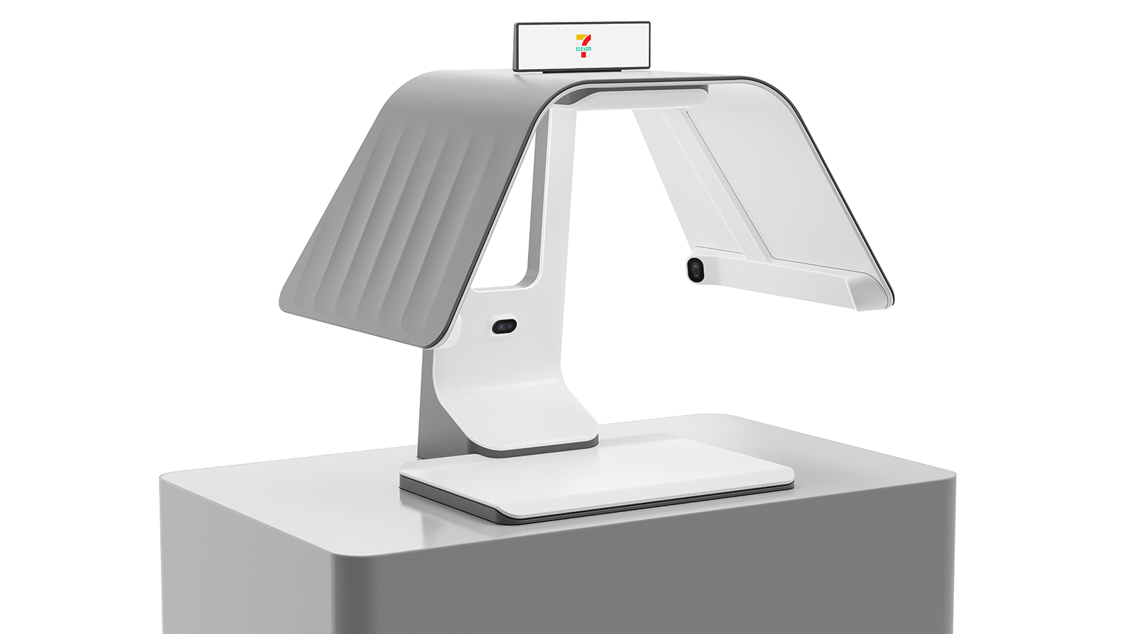
Finding a Form Factor
The core design challenge was integrating the required technology and ergonomic findings into a distinctive, memorable silhouette that could stand out within the visually dense 7-Eleven store environment. Noticing the original design felt closed off, I advocated for a more open, accessible form to create a more inviting and comfortable user experience.

PC: Sunny Owen | Senior Designer*
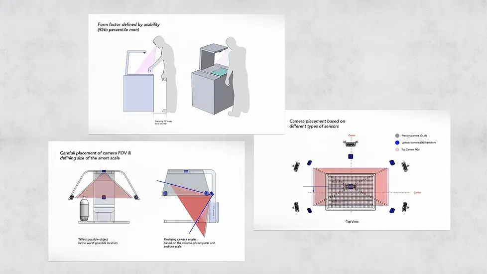
Balancing Strength, Ergonomics, and User Feel
To quickly evaluate accessibility and usability, we rapidly prototyped multiple concepts to test real-world interactions and refine key design decisions. To support efficient clerk assistance, the open design worked well, the approachable layout allowed for quick access to the scale area, item placement, and troubleshooting. Multiple prototypes were used to study how the unit’s silhouette occupies physical space, balancing visual presence, usability, and structural integrity.
PC: Sunny Owen | Senior Designer*
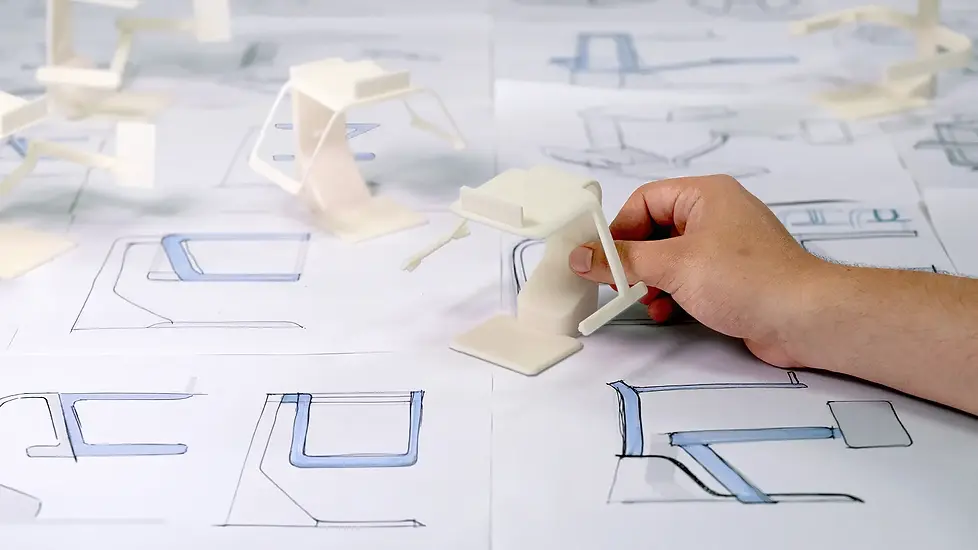
Making Miniatures
Following ergonomic testing, we refined the form based on key insights and quickly translated concepts into the physical world using 10:1 scale models as a rapid alternative to fully detailed prototypes. These models allowed us to evaluate design language, compare distinct directions, and gather more accurate, real-world feedback early in the process.

Phase 1 Concepts
After the initial exploration phase, I focused on two key themes: creating an open, approachable feel and reducing the overall visual bulk to avoid an intimidating presence. While these directions were not selected as the final design, my push for a more open experience, especially from the worker’s perspective, was carried forward into the final solution. The rear cutout enabled staff to easily monitor customers and assist with troubleshooting from behind the counter, creating a smoother overall experience.

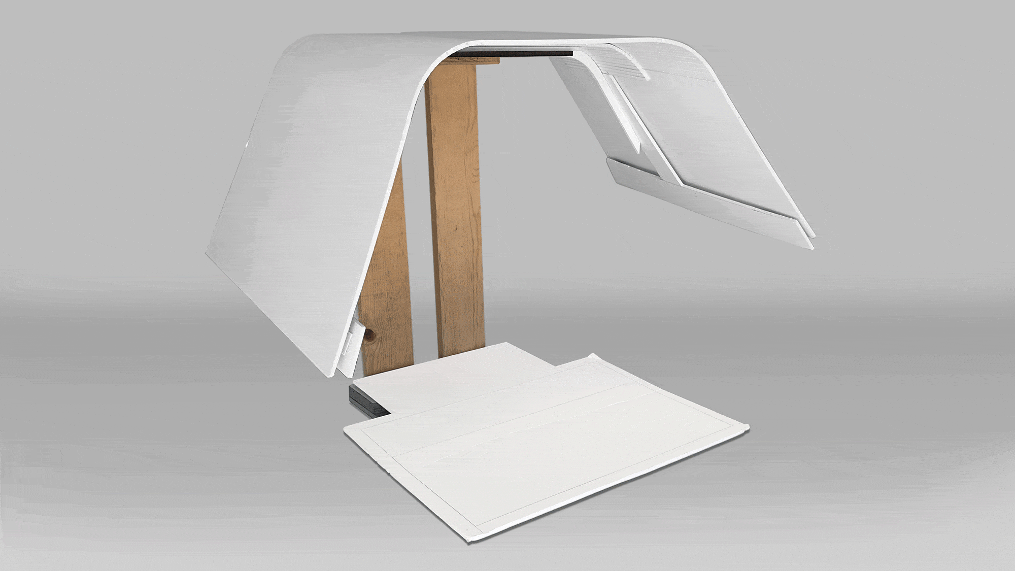
Full Scale Prototype of Selected Direction
Before progressing further, we built a quick, accurate prototype to validate the effectiveness of the rear cutout. Testing confirmed it improved usability by allowing workers to access items on the scale without overreaching; based on feedback, we extended the cutout forward to reduce the need to duck and improve comfort for taller users.

Carrying over Design Language to the POS System
Once the primary form factor was defined, I led the development of the accompanying POS system, establishing an optimal viewing angle for both standing and wheelchair users. The goal was to create a stable, durable design that felt cohesive with the main unit, aligning in form, CMF, and part breakdown, resulting in a unified final solution.
PC: Sunny Owen | Senior Designer*
Refining Based of Feedback
Client feedback provided valuable insight into how customers responded to different design iterations leading up to the final concept. One key takeaway was that the side covers received mixed reactions, as store sizes vary and larger enclosures were not always suited to tighter footprints.
In response, we worked closely with 7-Eleven to develop a modular side cover system that can be added or removed based on individual store needs. Close collaboration with in-house mechanical engineers ensured the uncovered configuration maintained structural strength and durability while withstanding everyday impacts.

Phase 2 Deep Refinement
Working closely with the Senior Industrial Designer and Design Director, we refined the defined form factor through extensive exploration of different design directions. To address varying store preferences, we developed solutions for a removable hood balancing the open, approachable feel with improved camera performance.
Process Feedback Loop
We refined the concept through multiple rounds of prototyping ranging from quick foamcore models to fully functional builds tested in real world settings. Each iteration gave us valuable insights from users, stakeholders, and others in the office. This allowed us to fine-tune the design, improve usability, and elevate performance and experience.

All Renders PC: Sunny Owen | Senior Designer*


