
7Eleven QCO
Self Check Out System
Year: 2021
Client: 7Eleven
Studio: StudioRed
Roles: Phase 1 Concept Development with Senior Designer and Device Ergonomics
Awards: IF Award, IDA, Good Design, and IDEA Finalist
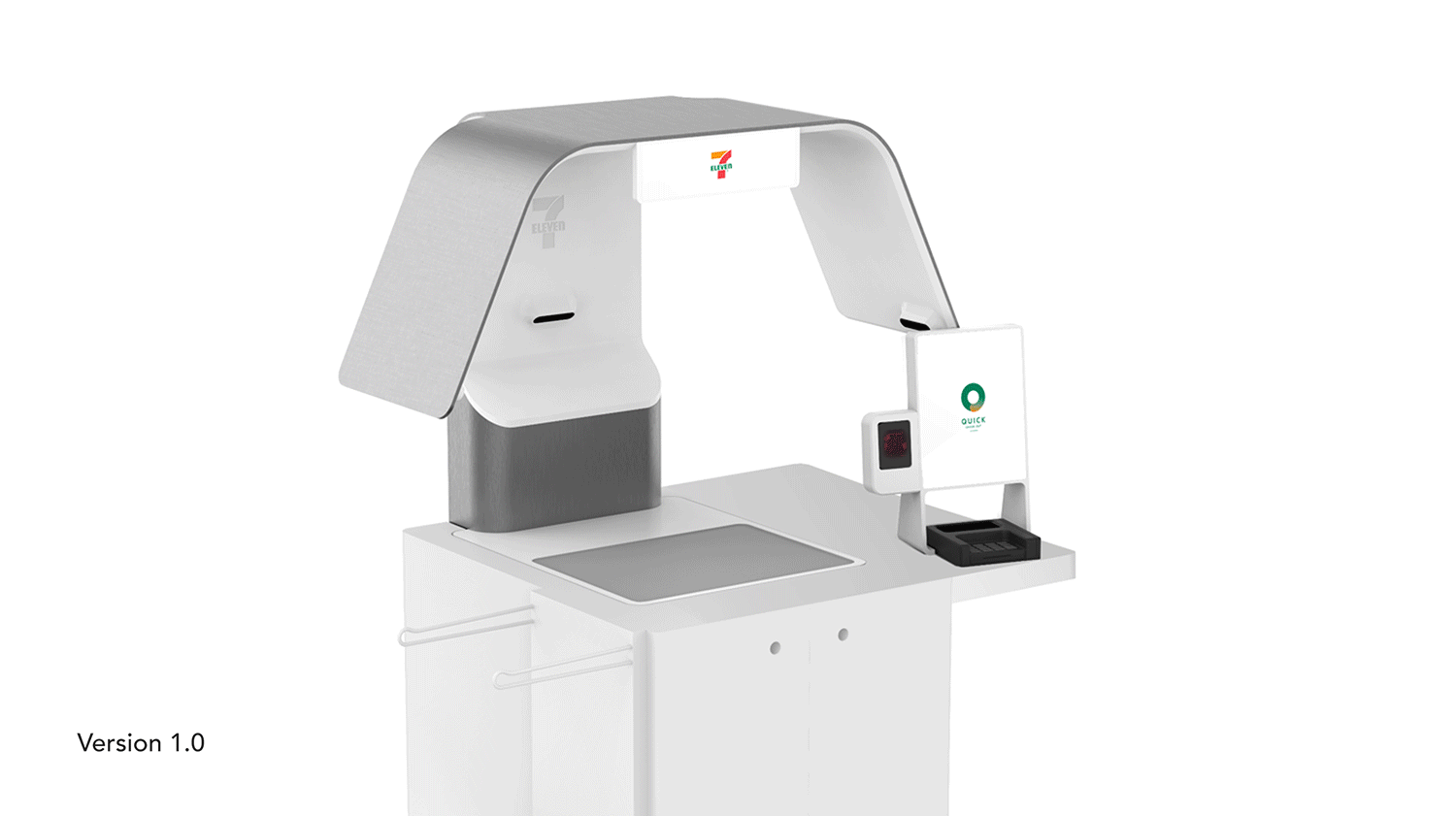
The Quick Check-out (QCO) is an automated self-checkout machine developed to help kick-start 7-Eleven’s transition toward a fully automated retail experience. The unit uses six integrated 3D sensing cameras to fully scan items placed in the scale area and automatically charge the customer accordingly. The system was designed as a complete solution, including both the physical self-checkout unit and the POS interface, ensuring a cohesive and intuitive experience across hardware and software.
The project was developed from the ground up through close collaboration between design, engineering, and 7-Eleven’s software team. The team led extensive ergonomic and accessibility testing to ensure the unit was ADA-compliant, intuitive to use, and easy to access. Particularly around the scale area where items are placed. Multiple rounds of prototyping and user testing were conducted to refine sensor placement, scale integration, durability, and overall usability. The final design balances performance, reliability, and ease of use while withstanding the high-traffic, demanding environment of 7-Eleven stores.

Efficiency is Key
From the start of the project, we understood that success would depend on delivering a simple, impactful experience. Our focus was on designing a process that's efficient for both the shopper and the employee, ensuring every interaction feels intuitive and seamless.
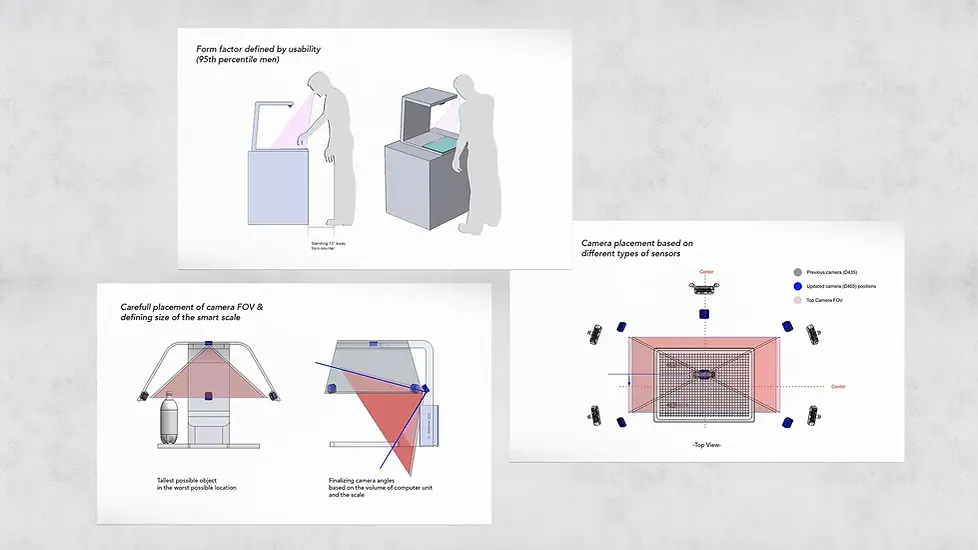
Defining Sensor Locations for Best User Experience
We collaborated closely with 7-Eleven’s software team to define optimal sensor and camera placement for a seamless user experience. Scale and camera positions were evaluated against worst-case checkout scenarios, using 5th-percentile female through 95th-percentile user studies to ensure all interactions remained accessible, intuitive, and unobtrusive.

Balancing Strength, Ergonomics, and User Feel
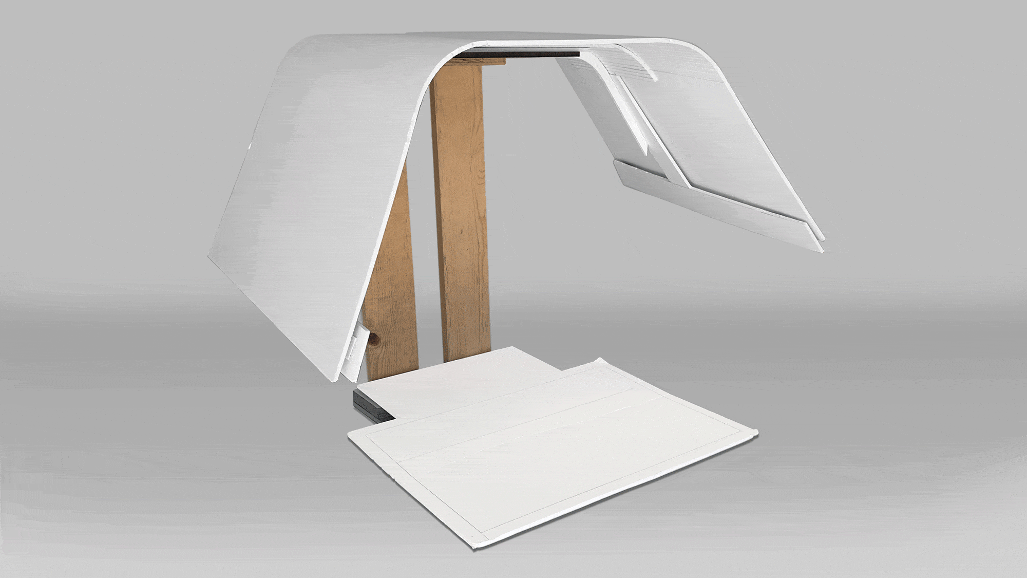
To support efficient clerk assistance, the unit was designed with an open, approachable layout that allows quick access to the scale area for item placement and troubleshooting. Multiple prototypes were developed to simulate real-world scenarios, evaluate functionality, and study how the unit’s silhouette occupies physical space—balancing visual presence, usability, and structural integrity.

Creating a Distinct Design Language
The core design challenge was integrating the required technology and ergonomic findings into a distinctive, memorable silhouette that could stand out within the visually dense 7-Eleven store environment. Rapid sketching and quick mock-ups were used throughout the process to test feasibility, sightlines, and overall presence in context.
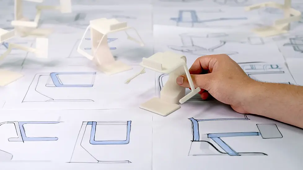
Making Miniatures
To quickly evaluate how the designs translated into the physical world, the team produced 10:1 scale models as a fast alternative to fully detailed prototypes. These models allowed us to assess design language, compare distinct design directions, and provide more accurate, real-world feedback early in the process.
Adapting Design Direction into Future Improvements
After converging on a final design, a full-scale functional prototype was built and deployed in active 7-Eleven stores for real-world testing. Feedback from in-store use informed refinements to the POS layout, screen placement, scale sizing, and sensor performance, including evaluations of camera coverage and system reliability. These insights allowed the team to iterate while preserving the core design language and overall visual intent.
Refining Form
Client feedback provided valuable insight into how customers responded to different design iterations leading up to the final concept. One key takeaway was that the side covers received mixed reactions, as store sizes vary and larger enclosures were not always suited to tighter footprints.
In response, we worked closely with 7-Eleven to develop a modular side cover system that can be added or removed based on individual store needs. Close collaboration with in-house mechanical engineers ensured the uncovered configuration maintained structural strength and durability while withstanding everyday impacts.


CMF
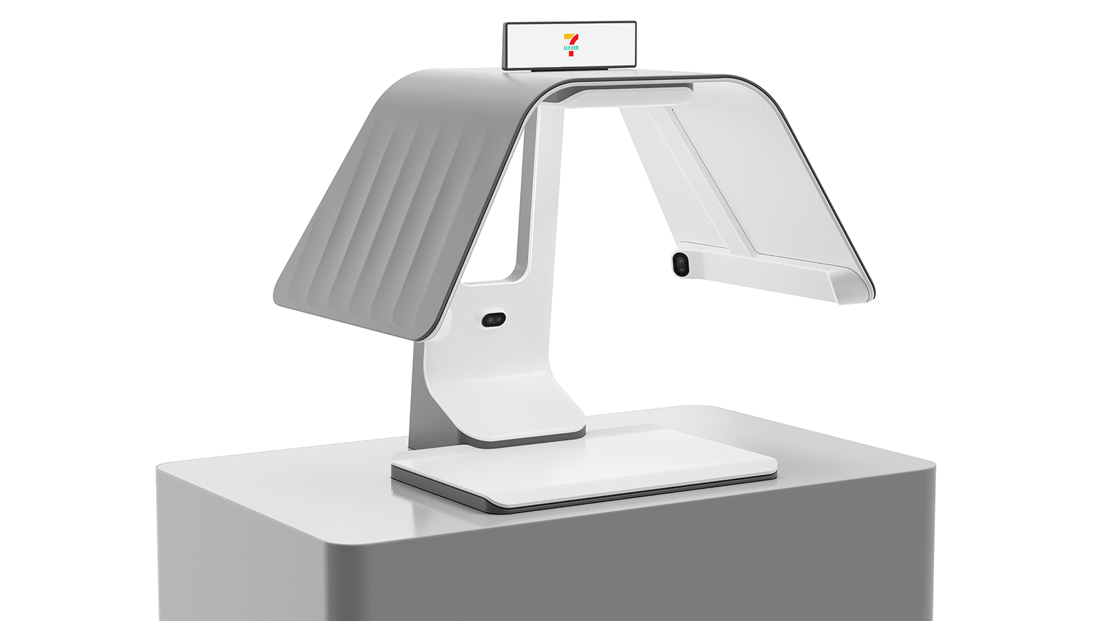
CMF exploration was conducted using painted 3D prints, color chips, and precedent studies. The final bead-blasted metal finish delivers a premium, technology-forward feel, while the darker palette subtly emphasizes key interaction points, creating a balanced and refined visual hierarchy.
Performance Optimization
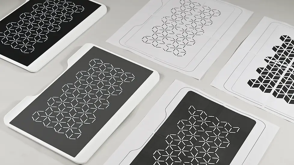
At each stage of refinement, the team evaluated whether improvements were best addressed through software updates, hardware adjustments, or targeted design tweaks. To improve sensor recalibration accuracy between uses, a visual pattern was introduced, significantly reducing false readings and speeding up checkout times. The pattern was refined in close collaboration with the software team to ensure optimal performance.

Shrinking the Design
Throughout the process, we implemented significant improvements driven by user feedback and engineering innovation. One major advancement was the reduction of the overall size of the unit. Making it less intimidating for customers while enabling seamless integration into smaller, space constrained 7Eleven stores.
Process Feedback Loop
We refined the concept through multiple rounds of prototyping ranging from quick foamcore models to fully functional builds tested in real world settings. Each iteration gave us valuable insights from users, stakeholders, and others in the office. This allowed us to fine-tune the design, improve usability, and elevate performance and experience.


